According to Dictionary.com, a logo is “a symbol or other design adopted by an organization to identify its products, uniform, vehicles, etc.”
Basically — it’s a graphic representation of you, your business, your brand.
So, what makes a logo good? What makes a logo like Apple, Nike, McDonald’s last years and are the most recognizable logos ever? What should you look for when you’re having your logo created or redesigned? According to JustCreative.com, just five principles.
Simple
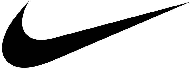
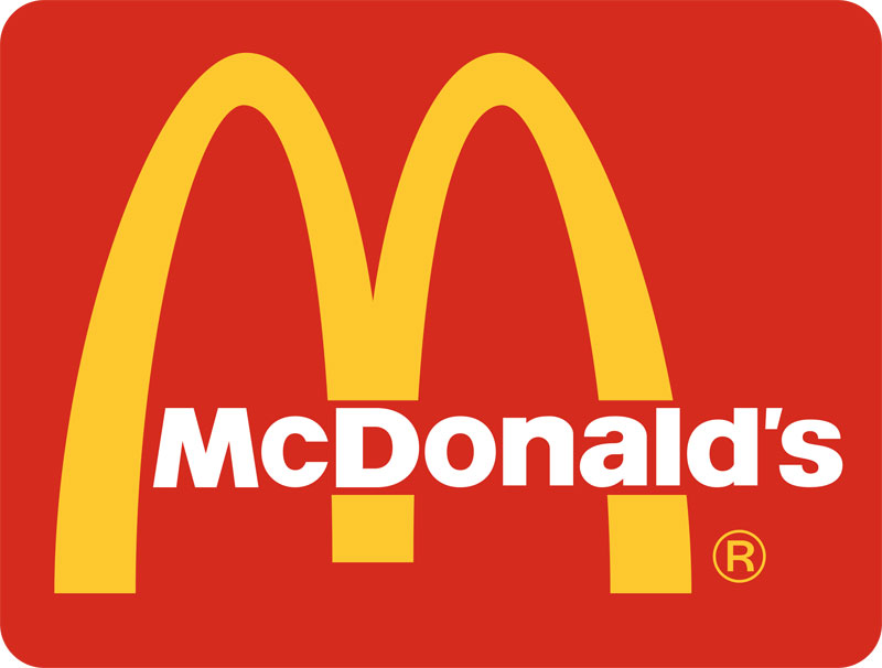
A simple logo is easily recognizable and can be easily versatile and memorable. Think the simple apple for Apple, the Nike swoosh, and the golden arches of McDonald’s.
Memorably
The close relative of simple, memorable logo design is achieved by being simple and appropriate to your brand.
Timeless
Will the logo still be effective in 10, 20, 50 years? While minor tweaks are okay, David Airy says “Trends come and go, and when you’re talking about changing a pair of jeans or buying a new dress, that fine, but where your brand identity is concerned, longevity is key. Don’t follow the pack. Stand out.”

Versatile
Chances are your logo will be used in a variety of ways in order to market your business. Your logo should look good in black and white, large or small, in horizontal and vertical formats.
Remember also, the more colors used, the more expensive it will be to print over the long term. A good rule of thumb is to keep the number of colors in your logo up to three, and it is able to convert to black and white effectively.
Appropriate
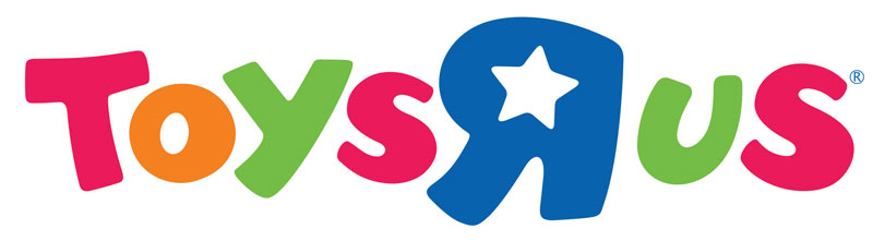
A logo should be appropriate for its intended purpose. If your business is selling children’s toys, it would be appropriate to use bright colors and a childish font. Not so much for a law firm.
Also, a logo doesn’t need to state what your business does or offers as a service — car logos don’t show cars (Audi has 4 rings), computer logos don’t show computers (Apple…).
Paul Rand says “Should a logo be self-explanatory? It is only by association with a product, a service, a business, or a corporation that a logo takes on any real meaning. A logo derives its meaning and usefulness from the quality of that which it symbolizes. If a company is second rate, the logo will eventually be perceived as second rate. It is foolhardy to believe that a logo will do its job immediately, before an audience has been properly conditioned.”