I love everything about music.
From the actual music itself, to the liner notes, to the album design. And because I appreciate a good cover design, I only buy CDs, and most recently vinyl. You just can’t appreciate a good cover design in a 1 x 1 inch square on your phone.
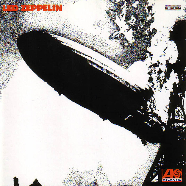
You don’t always need color to convey a good design. I’m not at all knocking Sgt. Peppers or Dark Side of the Moon, but a black and white cover can speak just as loud — Billy Joel’s The Stranger, The Rolling Stone’s Exile on Main St., or The Who’s Quadrophenia. The black and white allows for more detail to be shown. It allows the listener to just have a glimpse of what they’re in for.
Follow the button below for a list of 42 Classic Black and White Album Covers from BuzzFeed.com. Do you have a favorite that’s not on the list? Let us know in the comments below! For me, it would be Aerosmith’s Draw the Line.


