When an artist is approached by someone who doesn’t practice, they often hear “I wish I could draw.”
The best thing about art is that anyone can do it, no matter their skill level. You can be a complete beginner, a hobbyist, an art student, or even a professional in the field. Also, there are no boundaries to your creativity, and there are no rules to follow. The important part is that you are visualizing something in your mind and are trying to put it down on your canvas.
We all have imagination. We use it every day, sometimes without being consciously aware that we are doing so. When we dream, we’re using our imagination. When we come up with ideas, plan for the future, or remember things from the past, we’re using our imagination. And artists especially use their imagination: to create art.
Visualization is a technique that artists use to help them create their art. It’s a way of using your imagination to see what you want to create before you create it. By visualizing your work beforehand, you can better understand what you want it to look like and how it should feel when you’re finished. No matter how little or how much experience you have, you can visualize and move forward on your project regardless of your artistic skill level.
I focus a lot on character design due to my interest in cartoons from western and eastern cultures. A lot of the creativity that comes forward when creating characters usually encompasses what colors I want them to have, what presence they give off, and the setting they are in. Most characters I make go through an extensive development process – one, in particular, has gone through many renditions for over seven years now. This character is a fan-made concept created to fit into a television show that she will never be a part of but was created for my personal enjoyment. Whether created for fun or for professional use, visuals go through an extensive process, starting out rugged and then being refined, until the desired end result is achieved. Below I have shared the process of coming to a final design with the example of the character I created.

First is the rough concept, I had the idea of light hair color, bright green eyes, using a mix of black, bright green, and blue for clothing, and keeping it to a simple and basic design. The design choices were made for a few reasons: her family’s colors, which are related to electricity; the fictional country she is in usually has a predominance of black and dark blue clothing as their standard; her family’s practice is to not cut their hair. However, given why this character was created, she looks very basic and bland and will not stand out compared to other character designs in the television show’s world, and she is not a good representation of her family’s concepts.
This was from my early days of trying digital work and not being the best artist. I used what is known as a base, which is not too creative but is a start for what I want the design to become. Now it’s time to improve it by thinking about how this character can look more unique and identifiable. When refining a design, you should think about what you like from the original and what needs to be reworked. There could also be something that you now realize doesn’t work and needs to be removed from the design.

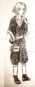
This next rendition focuses on the design of the outfit, independent of the colors. Because of a lack of color accessibility when I did this, I created it in black and white, focusing more on value choices, a term which refers to lights and darks, to make up for having no color. While there is an overall idea of values and what colors may go into this, the design is entirely different from the first rendition of the character. The original simple look evolved into something more complex. This different approach helped to bring in some new ideas and design adjustments in future drafts.
This design improvement now continues. Some things have completely changed and some new details were added, while other aspects stayed the same. Sometimes design ideas will get lost in subsequent versions. The important part here is that you should always look back at your research, notes, and pointers to see if you may have forgotten something you wanted to pop in. You can even look at historical and cultural aspects of your design to bring in elements from those areas, if appropriate. Research can be a very important aspect of design, especially if the design has roots or connections to something specific.

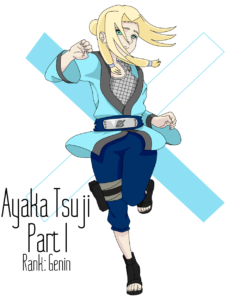
The next rendition of my design brings back color. Colors were adjusted based on values in the second rendition, with a balance between the first and second design due to the addition of different colors and design elements. This third version took more of the clothing design from the second, but not all of the values. This combination results in a “mashup” that is more appealing.
In addition, another design element is tossed in, which is the undershirt, a common design aspect in this show’s universe, which helps to bring a little “pop”. Having a small addition or adjustment may help an overall design. It could be a color, design item, pattern, or decal, that often helps to make things more interesting.

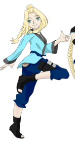
Now onto the final design for this character. All of her colors complement each other since I determined this palette and the color and value balance are best suited for the design. Nothing has changed in the clothing, except for an extra detail that wouldn’t be visual from the front. The only seemingly significant change would be a slight alteration in the hairstyle, which is the bun. While this is a small detail change, it was important to the overall design.
But at last, it is complete and ready to be shared. I have found this process of putting down a rough idea and refining it into its final form to work well for me. Hard work, playing around with different elements, and critiquing the previous renditions can assist you in developing your skill as an artist and take you on a path to producing your best art pieces.
