Typography choice is extremely important in shaping your brand’s identity. Fonts can evoke specific feelings or give your organization a certain visual connotation. In the first few seconds of viewing your company’s materials, your audience should get a clear sense of who you are. What do you sell? Who is your audience? What is your main field of work? What do you do? What category does your business fall under? Are you a luxury brand or something more fun? These are all questions someone may think of when they see your logo and branded materials for the first time.
This is why it is so important to select a font that matches your organization’s style, mood, story, product category, and field. The fonts you choose communicate tone, personality, and credibility instantly. Proper font choice contributes to reliable brand recognition by establishing a strong presence in your market all while differentiating you from the competition.
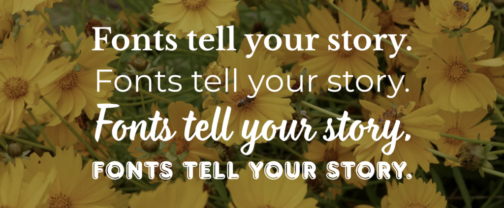
Font Styles & the Stories They Tell
Different font styles naturally communicate various emotions and shape a brand’s personality. Choosing the right style begins with understanding how you want your audience to feel. Typography isn’t just visual — it’s psychological. Every font communicates a distinct mood and perception. At Rapport Innovative Marketing, we believe that selecting the right typeface for your brand is just as important as choosing your color palette or shaping your message. It’s a key part of your brand identity.
Serif Fonts
(Traditional & Trustworthy)
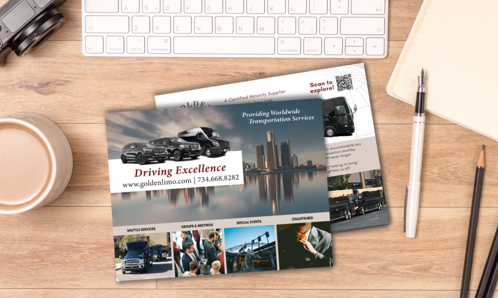
Serif fonts feature small decorative strokes at the ends of letters. They are often used by law firms, financial institutions, universities, and luxury brands. Our client, Golden Limousine International is a luxury transportation service company, and a serif font works perfectly to represent their brand. Serifs communicate longevity, authority, and refinement. If your brand values credibility and tradition, a serif typeface can reinforce that positioning.
Sans-Serif Fonts
(Modern & Approachable)
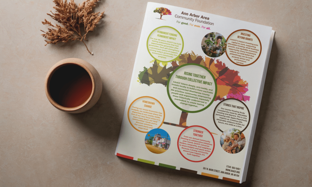
Sans-serif fonts remove the decorative strokes, resulting in clean, streamlined letterforms. Common among tech companies, marketing agencies, healthcare providers, non-profits, and lifestyle brands, sans-serifs communicate clarity, innovation, and simplicity. They perform especially well in digital spaces, making them a popular choice for contemporary brands. Our client, The Ann Arbor Community Foundation, is a nonprofit organization that supports the local Washtenaw County community and uses a sans-serif typeface in their logo and marketing materials, for a modern, approachable feeling.
Script Fonts
(Elegant & Personal)
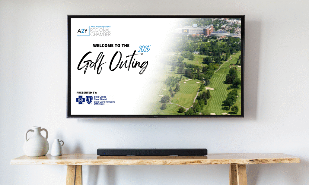
Script fonts mimic handwriting or calligraphy. Frequently used by wedding planners, boutique retailers, beauty brands, and artisan businesses, script fonts work well as event headlines and welcome signs, like for the A2Y Chamber‘s Golf Outing. Script fonts evoke creativity, craftsmanship, and elegance. They are typically best used as accent elements in logos or headlines rather than in large blocks of text.
Display or Decorative Fonts
(Bold & Expressive)
Display fonts are designed to stand out. Often seen in restaurants, service industries, entertainment brands, children’s products, or creative studios, they add strong personality and visual interest. This type works well for groups that want to separate themselves from traditional businesses. Since these fonts are attention-grabbing or more complex, they work best in headlines or branding elements rather than body copy. Broomz is a premium cleaning solution company and the decorative font in the logo catches the viewers eye and gives insight quickly into the type of industry Broomz falls under.

Font Pairings
As seen in the Broomz example above, the logo font is a decorative font, but the body copy on the business card is a sans-serif font. This commonly happens when using a decorative or display font. These fonts are designed for headlines, logos, and subheadings, and typically work best when paired with a sans-serif font for body text and smaller details.
Font pairings should create visual harmony and provide contrast to help viewers understand hierarchy. A good approach for selecting font pairing is as follows:
- Primary font: used for headlines, hero text, and brand-defining elements. This font can be more expressive or stylized. (Ex. Display or Decorative Font)
- Secondary font: used for body text, UI labels, or paragraphs. It should be simple, highly legible, and perform well at smaller sizes. (Ex. San-Serif Font)
Choose Fonts That Last
Fonts should fit your company’s needs for the long term. Consider questions like: Will this font still represent your brand five years from now? Does it work across all platforms? Does it offer multiple weights and styles for flexibility?
Strong typography systems are scalable and adaptable. Be mindful to select a font that aligns with your brand personality, audience, and goals, creating consistency and recognition over time. Avoid selecting a font just because it’s trending; this rarely leads to lasting impact.
What font style fits your brand? Serif, sans-serif, script, or display?
An Example of Proper Font Selection
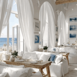
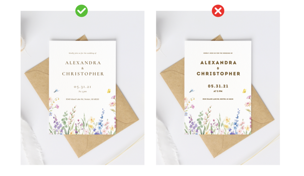
The correct font selection can affect the entire vibe of a piece. Selecting a serif font for a wedding invitation makes the invitation feel more elegant and refined. The san-serif font is legible, but it does not evoke the feeling or essence of the wedding event. The serif font feels elevated and matches the wedding’s style.
What’s New in Typography?
One of the biggest advancements in typography is the rise of variable fonts. Unlike traditional font families that require separate files for each weight or style, variable fonts allow designers to adjust weight, width, slant, and optical size within a single file.
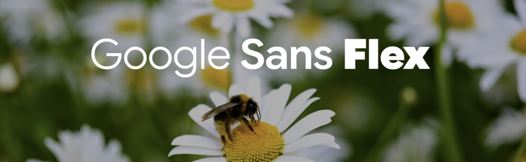
A strong example of this innovation is Google Sans Flex, a variable typeface designed to adapt seamlessly across digital environments. This kind of flexibility allows brands to maintain visual consistency while adjusting typography for different screen sizes, layouts, and accessibility needs. For businesses, this means cleaner performance, improved readability, and greater design versatility.
Variable fonts are especially valuable for brands that operate heavily online, where responsive design is essential. However, while modern typography tools offer exciting possibilities, they work best when paired with a clear brand strategy.
Fonts Tell Your Story
Whether you use a variable font or one of the styles above, when typography aligns with your brand voice, values, and audience expectations, it builds trust and strengthens recognition. It supports your messaging instead of distracting from it.
With thoughtful font selection, typography becomes a powerful tool for clarity, connection, and growth. The right typeface plays a vital role in defining your brand and communicating your story. Contact Rapport Innovative Marketing to begin shaping your brand with purpose.