
Earlier this year, Pantone released their forecast for this year’s top 10 fall colors.
The Pantone Color Institute is the “authority on color, provider of color systems and leading technology for accurate communication of color.” Basically, if you want a very specific color for your project, a Pantone color will look the same with any printer or on any fabric. Designers carry Pantone color swatches around like a painter does with paint samples.
In February, Pantone released their top 10 colors for fall. In keeping with the soothing colors from the spring Pantone palette, the fall colors also lean toward more muted tones that are meant to “create a transporting and transformative canvas,” according to Letrie Eiseman, executive director of the Pantone Color Institute.
Eismen singled out the “modern-day stresses” of near round-the-clock presidential coverage, the ever-present demands of living tethered to smartphones, financial uncertainty and job insecurity as factors that played into choosing the colors. She explained, “With all the angst that’s out there in the ether and in the world around us, there is a need for more calming colors.”
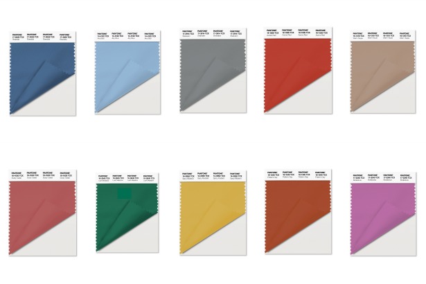
These calming colors are:
- Riverside
- Airy Blue
- Sharkskin
- Aurora Red
- Warm Taupe
- Dusty Cedar
- Lush Meadow
- Spicy Mustard<
- Potter’s Clay<
- Bodacious
Keep an eye out on these colors making an entrance into the fashion world and design this fall. What do you think about them? Which one is your favorite? Let us know in the comments below!