
From 20 Famous Logos Color Swapped with Their Competitors by CreativeGuerrillaMarketing.com
When Brazilian graphic designer Paula Rupolo was commissioned to create a unique branding identity for a new coffee-based soft drink, she researched the role color has on logo and brand design. During her research, she took several different iconic logos and swapped colors with their rivals.
As you can see in the examples to the right, the color swap greatly affects the brand’s image. The iconic green of the Starbucks logo just doesn’t look right when placed on the logo of the Dunkin’ Donuts logo.
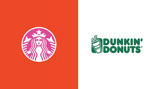
Dunkin’ Donuts’ colorful branding colors has been swapped with Starbuck’s more toned down green and white.
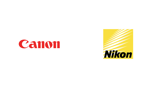
Canon’s signature red is switched with Nikon’s iconic yellow.